Saturday, August 15, 2009

Ultimate Comics Avengers #1 Review


Ultimate Comics Avengers #1
The Next Generation
Part One of Six


Written by: Mark Millar
Art by: Carlos Pacheco
Inks by: Danny Miki
Colors by: Justin Ponsor
Letterer: VC’s Cory Petit

The issues starts off with a great wrap around cover with a splashy #001 to draw you in. Luckily, the inside isn’t half bad either. Having not read an issue of the Ultimate line in a few years I wasn’t sure what to expect, but one thing is clear; this is a number one. If you’re concerned that continuity might make the book too difficult to follow after the Ultimatum crossover lay your fears to rest. While I didn’t understand everything, I would say I was able to keep up with 90 to 95 percent of everything the characters discussed or did.

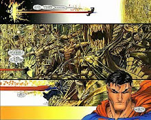
Nick Fury is brought back to retrieve a rogue Captain America who disappeared after discovering an interesting revelation, that should have some lasting repercussions on him and the whole team. Hawkeye recounts exactly how Cap found out this secret during a battle with some AIM agents. The fight is well choreographed but I have to say that it featured so many people leaping or jumping through the air without parachutes that it became redundant by the end of the issue. Something like that should make for a good splash page, but after you see it a few times it loses its luster.

Having said that the art has been well hyped, but truthfully I found it to be stale and fairly generic. It even went so far as to remind me of the art I saw in the Avengers cartoon movies. It wasn’t all bad though, the pages featuring Tony Stark had real impact. The inks and colors nicely helped to contrast Tony’s space with Carol Danvers, well done and again you could feel the intensity of the fight.

The page turning story, riveting action and frightening reveal offset the decent artwork enough to make this book worth picking up and adding to your weekly stash.

B

Sunday, August 9, 2009

Amazing Spider-Man #601 Review


AMAZING SPIDER-MAN #601
Red Headed Stranger: No Place Like Home

Written by: Mark Waid
Art by: Mario Alberti
Colors by: Andres Mossa
Letterer: VC’s Joe Carmagna
Cover by: J. Scott Campbell

Following the events of issue 600, we finally get a book free of super-villains and get a chance to see just how difficult Peter Parker’s life can be even without Spider-man.

Mark Waid crafts a fun, fairly self-contained story that takes place the day after Aunt May’s wedding. Evidently, Peter gets pretty trashed at the wedding, wakes up in bed with a very angry roommate, and slightly remembers something about a date he has with Mary Jane. Only problem is, he doesn’t know the time or place.

Without a clear villain we get to spend a bit more time with Peter as Spider-man as he tries to figure out what happened the night before, find a new place to live and save the city. This book was funnier than the recent “American Son” storyline, which is a welcome relief as this is how Spider-man is supposed to be, a quipy, one-liner type-of-character, who always has a joke, no matter how down his situation might get. It’s also nice to see some minor characters come back into the spotlight including Betty Brant and Glory Grant. I do worry though how long the Reilly family is going to be hanging around since they don’t add a strong dramatic element and only serve to eat up pages that could be better served with something that’s actually interesting.

After being spoiled in #600 with Romita Jr., Alberti has some big shoes to fill. While it’s not always what you would expect, and sometimes it can be pretty hit and miss, it manages to work, especially the further you get into the book. I get the feeling that Alberti got more comfortable with the material the more he drew. I especially liked Peter’s Captain America boxer shorts.

This is a good issue and solid jumping on point, even if you missed #600. Mark Waid has a strong handle on the character and the art is sufficient despite being nothing special. Also, this remains one of the few books that is still three dollars. An affordable and enjoyable book, what more could you ask for?

B

Sunday, August 2, 2009

Lethal Legion #2 Reivew


Dark Reign: Lethal Legion #2

Written by: Frank Tieri
Artist: Mateus Santolouco
Color art: Chris Sotomayor
Letterer: VC’s Joe Sabino
Cover: Tommy Lee Edwards

At SDCC I asked Frank Tieri if this would be an ongoing and sadly the answer was no. It certainly doesn’t need to be I admit, but I always enjoy books that feature B or C-list characters. Too often we’re saddled with A-list players who have to fit into status quo molds and can’t be changed or killed. Lower tier characters like these give writers more opportunity to play and maybe even kill one them off, once in a while.

This issue features Livingston, a high-priced lawyer, interviewing Wonder Man and Absorbing Man in prison and they both give their accounts of what happened to the Legion, from its formation to their final encounter with Osborne’s Dark Avengers.

None of these characters are at all likable and oddly that’s one of the reasons I enjoy the book. These aren’t your typical heroes and they make a real point to prove that. They’re bad guys and just because they’re going after Osborne doesn’t mean they’re ready to turn over a new leaf. Tieri is at his best here working with characters long ignored and playing them up with larger than life characterizations that make it easy to figure out where they’re coming from.

The art is dark and gritty, just as it should be. Wonder Man looks badass and the fight with the Dark Avengers feels as big as it should. For a three issue book they put a lot of love into it.

The book ends on a strange note and how this series will end is anyone’s guess. I’m not sure how they’ll wrap it up with only one book left, I just hope they don’t continue it in an ongoing instead. It also relies on you knowing more than you should about the characters and their past relationships, which makes it difficult to keep up at times. Also, since it is only three issues there’s not much incentive to buy the floppies rather than wait for the trade, especially as it doesn’t feel like it will have much impact on current continuity. In fact I don’t expect it to have any impact on anyone not featured in this book. So if you aren’t a huge Wonder Man or Grim Reaper fan, you can skip this without missing much.

With a healthy dose of action, fun anti-heroes and an unpredictable storyline Lethal Legion remains a good book for those looking to collect everything Dark Reign, but it’s not a requirement for anyone following current Marvel events.

B

Detective Comics #855 Review


Detective Comics #855
Elegy Part 2: Misterioso

Writer: Greg Rucka
Artist: J.H. Williams III
Colors: Dave Stewart
Letters: Todd Klein

This is only the second issue from this creative team, but already it is one of the most beautiful books on the stands today. Each page unfolds better than the last leading to a final panel that leaves Batwoman at the end of a very short rope.

The book opens with Batwoman taking the upper hand and using it to question Alice about the Crime Bible and her connection to it. She doesn’t get many answers before Alice reveals how resourceful and violent she can be. Things only get worse for Kate as Alice and her forces play their trump card.

This issue is pure fluff never giving any answers, while posing almost no new questions. Regardless, the action is well choreographed and the art is as good or better than you’ll find in any book today. I’ve seen Williams’ art before and never have been as impressed. Batwoman’s opening splash page featuring her leaping over villains and snapping necks looks gorgeous with its red hues and kinetic images. Alice is another stand-out character sketched with emotional guile, intensity and lace.

Alice herself is written as well as she’s drawn thanks to Rucka’s tireless efforts to continue to use quotes taken directly from “Alice in Wonderland.” This direction helps to add to her insanity and works to show how truly broken her mind has become. I appreciate that while knowing about the Crime Bible will help you understand the book in a more well-rounded fashion it is never necessary to appreciate it.

Batwoman is, surprisingly, a bit more confusing. In her introduction during the pages of 52 she was presented as a rich almost selfish socialite, but now she comes across like an army brat who never had more than a dollar to her name. This dichotomy almost works, as she needs both money and combat training to be Batwoman, yet they don’t try and make the two halves mesh in any consistent way. Hopefully, down the line they’ll figure out a way for these different parts of her life to work as one, but so far they’re not making any effort.

The eight-page “Question” back-up is decent if not forgettable. This story probably features my favorite representation of the character as played by Renee Montoya, but the story itself is a generic kidnapping case with no twists or cliffhangers. Out of all the back-ups so far “The Manhunter,” is still the one that captures my attention the most.

This title is the longest continuously published book in United States comic history and still remains one its best. An easy recommend for anyone who enjoys, Batman, Gotham or as the title suggests; a good detective story.

A-

Saturday, August 1, 2009

The Stuff of Legend #1 Review


The Stuff of Legend
Th3rd World Studios

Volume 1: The Dark, Book 1

Story by: Mike Raicht and Brian Smith
Illustrated by: Charles Paul Wilson III
Design and Color by: John Conkling and Michael DeVito

I first heard about this book on Free Comic Book Day, but missed out on picking up the preview. I nearly forgot about it until Marvel editor C.B. Cebulski, tweeted a recommendation for it earlier this week. At five dollars it is not for the faint of pocketbook, but that is truly one of the only things I have against this book.

Set during World War II the story finds a young boy kidnapped by the boogeyman and taken into a place known only as the Dark. A set of his toys and his dog march out into this foreboding void to rescue him.

This is where things really begin to develop. In the our world the teddy bear is afraid and unable to protect the boy, but in the dark he transforms into an unstoppable animal tearing and devouring the boogeyman’s armies. Each of the toys becomes more real in someway, the Jester (a jack-in-the-box) turns into a creepy, blood-thirsty warrior, while the piggy bank is just as afraid in the real world as he is the dark. It’s here in the dark that the characters truly gain some strong emotional resonance and where you learn that no one is safe.

The art is also worth noting. Wilson’s art has a magical quality that naturally reinforces the beauty of the simple narrative. The boogeyman is a standout character, who feels both frightening and seductive at the same time. He also does a nice job conveying feelings even as the characters do not speak. The initial battle sequences are difficult to figure out a first, but only because you don’t count on there being so many characters. It doesn’t take long though to catch up and enjoy the blood soaked images.

For the most part this book is color free, but it does feature what I would call subtle earth toned colors that give it an older feel in keeping with the 1940s time period in which it is set.

This book most reminds me of Fables, with its storybook-like characters and mystical worlds that normal people can’t see. Despite this slight comparison the book remains unique and worth your time, but I understand if the price turns some people off. As the book ends, questions still linger. Its cliffhanger also left me happily surprised and I already can’t wait for the next issue to come out in September.

A-

Saturday, June 27, 2009

USAGI YOJIMBO #121 Review


THE HIDDEN FORTRESS
Created, Written and Illustrated by: Stan Sakai
Front Cover Colors: Tom Luth

I first remember this character as an action figure that was attached to the Teenage Mutant Ninja Turtle toyline back in the 1980s. He always stuck with me as something special, almost a tragic yet noble figure. He remains that way today.

This series has always been well remembered yet under appreciated at the same time. I rarely pick up an iassue but when I do I'm always left feeling like it was worth it and this story is no expection.

The book picks up with Usagi running across a failed attempt by some bounty hunters to capture a powerful, local bandit. Usagi finds a lone survivor and offers his assistance. It turns out though, that things aren't quite what they seem.

The joy of this book for me comes in its simplicity and how easy it is to pick up. While the character is steeped in continuity and a rich history, Sakai always allows for new readers to jump on. This trait is certainly a positive but it does hurt the book, by keeping it from being memorable. The art is wonderful as always with clean, strong lines and suspenseful action. Nothing is lost in the translation from written word to the printed page.

Regardless of its quick story this is a great read and one that I would suggest picking up every month.

B+

Saturday, June 13, 2009

Action Comics #878 Review


Action Comics #878
Sleepers Part Four

Written by: Greg Rucka
Art by: Diego Olmos
Colorist: Rod Reis
Letterer: Rob Leigh
Cover by: Andrew Robinson

“Sleepers Part Four,” which is part of the “World Without Superman” arc also falls in as part twenty-nine of the overall New Krypton story. That’s a lot of numbers, continuity and characters to keep up with, even for Superman.

The basic through-line for this book follows Nightwing and Flamebird as they hunt down Kryptonian sleeper agents placed there, perhaps by General Zod, but even they don’t seem to be sure. All the while, General Lane, is hunting them and the sleeper agents. This issue focuses a “Bonnie and Clyde” type Kryptonian couple. Unlike, their historical counterparts they don’t rob banks and they don’t seem to have a clear agenda, just pure mayhem.

All this makes for a pretty muddled book. Not enough time has been given to developing the protagonists or shaping the goals of the villains. The one sleeper they captured earlier was killed in the last issue, without divulging any information. These new Kryptonians don’t seem to be sleeper agents, which makes me wonder why they’re being shoved in the middle of a storyline that doesn’t appear to involve them.

Greg Rucka’s best work remains “Queen and Country,” which I highly recommend, but this on the other hand won’t be fondly remembered. There just isn’t enough time given to character, instead there’s a misguided focus on action. This book usually always involves some kind of fighting, otherwise everyone is resting from the last fight in anticipation of the next one. The sudden romance between Flamebird and Nigthwing feels thrown together, in some kind of effort to make the characters a tad more relatable. It doesn’t work.

Another bit of convenience comes when the Kryptonian couple attacks a house in the middle of nowhere that just happens to be owned by a congressman. This immediately brings out the police, who discover some gratuitous semi-nudity and quick deaths. How many times do you need to show how strong Kryptonians are? It seems unnecessary to show them killing a few police officers. We already know they‘re bad and we already know they‘re strong. Those few pages could have been better used to develop characters or expand on the sleeper storyline.

I’m looking forward to the Annual in hopes that it will explain a lot of what’s going on. On the other hand, I don’t feel that I should have to wait for an Annual to tell me what’s going on in the monthly book.

The art in this issue feels rushed at times and lacks a strong focus much like the rest of the book. Nothing about it stands out. Everything is very poorly defined and half-done. I also didn’t like all the Kryptonian subtitles. They’re hard to read and don’t add much to the story. Couldn’t they have just made some notation at the beginning of the book letting us know that certain portions (perhaps surrounded by parenthetical) are translated from Kryptonian to English? It’s funny that they speak it on Earth but not on New Krypton. Is it because they know Superman can’t speak it and they’re trying to help him out?

Overall, there’s no reason to buy this unless you absolutely need to. If it weren’t connected to the “World Without Superman” story I would have left it on the shelf.

C-

Saturday, May 16, 2009

The Walking Dead #61


Walking Dead #61

Written by: Robert Kirkman
Art by: Charlie Adlard
Letterer: Rus Wooton
Grey tones, Cover colors: Cliff Rathburn
Editor: Aubrey Sitterson

The greatest strength of this book is the question that it keeps asking. What is more dangerous? The zombies or the survivors? While it refuses to outright answer this, it always gives great arguments for both sides and this issue is no different.

Without giving anything away, this issue is intense. Kirkman doesn‘t need the undead to keep things interesting and he proves that in spades with this issue. Rick, Abraham and the rest of the group continue their long march to Washington free of the zombie menace for the moment. This doesn’t mean however there won’t be trials to face. Things happen fast in this issue with some powerful consequences and a few secrets. It will be interesting to see how these things play out later.

I also enjoy the shifting dynamic of the group. Rick and Abraham haven’t always seen eye to eye, yet here they almost finish each other’s sentences. All of this comes naturally though, and never feels forced or inorganic. Real motives, create real dialogue that comes from character rather than plot. It’s an impressive trait that this book has held onto well.

The art does a nice job of bringing all this dialogue to life. Even without zombies there’s still real power in the pencils and inks. This books feels like you could figure out what is going on without relying on the words, but they do manage to compliment each other well.

If I have any complaints about this book, it’s that these characters never seem to get a real win. There’s small victories here and there, but there’s never any lasting peace or happiness for anyone. I realize that it may put an end to the book if they did find some relief, but it would be nice to see someone get a real victory. Finally, there’s a tease at the end of the book, but I’m still waiting for an honest to God reveal of these so-called “hunters,” whoever they may be.

This may not be the best starting out point for new readers, but “The Walking Dead” remains one of the best books on the shelves today. If you are looking to get into this series I would recommend reading the collection they just printed which gives you issues 1-48 for only 60 bucks. A great deal, if you have the time and money to invest.

A-

Sunday, April 5, 2009

The Mighty #1-3 Review


The Mighty #1-3
(issue 3 cover featured)

Written by: Peter J. Tomasi and Keith Champagne
Art by: Peter Snejbjerg
Letters by: Rob Leigh
Colors by: John Kalisz
Covers by: Dave Johnson

“The Light Brigade” was the first book I read written by Peter J. Tomasi. I’ve made an effort ever since to pick up anything else that he writes. While his work on “Green Lantern Corps” is fantastic, his “Nightwing” run fell flat for me. His newest title, a creator-owned book called “The Mighty,” remains steadfastly in the middle.

After three issues it still hasn’t developed a story, rather it keeps itself focused on character. Not the worst quality in a book, I only hope it doesn’t last forever. Issue one opens with a quick, succinct introduction to Alpha One, the world’s first superhero. On a side-note, it’s interesting that this is a DC book rather than a Vertigo imprint since it doesn’t take place in the DC world. Things continue to move with a great sequence featuring Alpha One rescuing an out-of-control train. It’s after that in which things slow down. The leader of Omega Section (the organization that works in tandem with Alpha One), Captain Shaw, is killed, but by issue two his killers are put to rest. I expected this to be an ongoing thread for a few more issues but instead it’s tied up rather quickly.

Issue three puts up Gabriel Cole, the book’s central character, as Shaw’s replacement. Several years earlier he was rescued by Alpha One so his connections to the hero extend back for most of his life intensifying his relationship with the hero. The book does a nice job answering some key questions, like who funds Alpha One’s operation and the extent of his powers. Noticeably, one thing it leaves out is Alpha One’s true identity. He may be a maskless hero but his true name is never given, at least not yet. Whether or not this will be a factor later on remains to be seen. Shaw’s murder case seems too neatly tied up, so again I’m hoping that it comes back into the limelight.

Tomasi and Champagne are taking their time carefully setting up the world, its characters along with slowly revealing bits of its past safeguarding what they intend to disclose later. I appreciate their approach but I worry that this direction could lose a lot of interested readers who picked up the first book or two. I’m always of the mindset that a book needs time to grow, but frankly I think this book’s time is running out. Future solicitations claim big things, but unless they step-up to such big talk I may remove it from my pull list. Especially with other more interesting genre bending characters like “Savior 28,” and “Irredeemable,” already proving to have more promise with less material.

Snejbjerg manages to remain a hidden gem in comics. His art reflects a slick retro style not seen much in comics where attention to detail is as important as retaining a personal quality with every page. Sometimes I find that I can’t tell one artist from another or they simply don’t do anything noteworthy with their pages. Snejbjerg is someone I don’t see often, but I still enjoyed what he brought to “The Light Brigade,” and he does the same thing here.

A nice bit of art lifts a thoughtful yet unremarkable story just enough for me to pick up a fourth issue, but admittedly unless it turns the tide and brings a truly climatic “to be continued,” I don’t think I will.
C+

Saturday, April 4, 2009

Flash: Rebirth #1 Review


Flash: Rebirth #1
Lightning Strikes Twice

Written by: Geoff Johns
Art by: Ethan Van Sciver
Letters by: Rob Leigh
Colors by: Alex Sinclair

This is a Flash story, but the first issue is slow. Its sole purpose is set-up and where this story is going remains to be seen. I still haven’t figured out why Barry Allen is back and he’s asking himself the same question throughout this book.

Everything starts with a couple of murders, by someone or something who claims to have brought Barry back from the Speed Force. From there we cut to several different events that are meant to welcome the famous speedster back to the land of the living. Both Jay and Wally take the opportunity to pontificate on how much Barry meant to them and how happy they are that he’s back. All this feels too retrospective, especially since there are only five issues to this “rebirth,” I was hoping for a bit more forward momentum.

My favorite moments come when Barry and Hal meet at the Flash Museum. It really defines Barry’s character and his motives. It was a real turn and completely unexpected. Earlier pages painted this as more happy-go-lucky story, but Barry is anything but. Instead, he’s focused and determined. He doesn’t care about parties or parades. He comes across as a bit cold, but I feel like this gives him a chance to grow throughout the series rather than stay stagnant.

Towards the end of the book two kids find the Black Flash apparently dead in the middle of a field. This probably raised the biggest questions for me. Is the Speed Force really knocking off Speedsters? Is Barry’s new lease on life connected to this killing spree?

Johns has written some memorable Flash stories before and this one reflects his understanding of the characters, not just as heroes but as a family. Right now though, Barry seems to be rejecting that family so it will be interesting to see how that comes into play later.

Looking ahead at further solicitations though it seems there will be yet another Superman/Flash race. These exhibitions seem to happen like clockwork and only serve to slow down whatever story is actually happening. It’s too early to complain with due fairness but I don’t really see the point yet.

In terms of this issue though the set-up is unclear at best. The mystery comes too late in the book and where it’s going is anyone’s guess, but I remain ever hopeful and confident in its outcome.

Van Sciver handles the interiors on the book and as usual provides some stunning visuals. I especially enjoyed the not-so-subtle nod to “The Brave and the Bold.” I can only imagine his art will continue to impress as the action ramps up in further issues. Van Sciver is one of my favorite artists so I’m glad he’s working on this book. I do wonder though what it would have looked like if Scott Kolins had handled the artwork instead. Regardless though, each panel features fantastic character work and use of space. For instance, you really feel the size and scope of the parade and the intensity of the book’s final chase.

A solid first issue, but it definitely lacks a real hook to bring anyone back for another issue and uses too much of its time looking back rather than forward. It also caters exclusively to Flash fans with constant references and nods to the past on almost every page. Despite its slow pace the book remains a real treat though and I have every confidence that the payoff will be well worth the journey.
B-

Sunday, March 29, 2009

Batman: Brave and the Bold #3 Review


Batman: The Brave and the Bold #3
President Batman

Written by: Matt Wayne
Art by: Andy Suriano
Inks by: Dan Davis
Letters by: Swands
Colors by: Heroic Age

I was sad to see “The Legion Superheroes” cartoon go off the air in favor of “Batman: Brave and the Bold,” but all tears aside this new incarnation of the character is frankly, a lot of fun. I always smile and I always laugh when I watch the show. So, I couldn’t resist buying an issue of the comic that bears its name. It’s President Batman, what’s not to love?

The story is fairly straight forward, with no real surprises, as Batman pretends to be the president in order to find out who is trying to kidnap the leader of the free world. He brings Green Arrow along for the ride and the two discover the nefarious Ultra-Humanite, before he becomes an ape, is behind the dastardly scheme. Punches are thrown and the good guys win, all with a little tongue and cheek. I particularly enjoyed the scene when Batman as the president beats up members of congress who are fighting on the House floor. It’s so over the top, not to mention rewarding, seeing politicians eat a knuckle sandwich.

Matt Wayne captures the spirit of the show right from the first page. He’s well versed though, having written an episode himself along with several other DC cartoons and their related comics. His name should be familiar to many. Green Arrow is sadly never that interesting on the show and he doesn’t have much to do here either. I’m not sure who I would have preferred, but I wish they’d given a real D-list hero a chance since Batman is the main draw regardless of who he’s paired with.

The art is pretty much on model with the style of the show. The colors are bright and everything is fairly typical of cartoon based comics. On a side note part of me enjoys the cheaper quality paper that the comic is printed on. It reminds of simpler days when comics didn’t cost four dollars.
B

Oracle: The Cure #1 Review


Oracle: The Cure #1
Home Again, Home Again

Written by: Kevin VanHook
Art by: Juilan Lopez and Fernando Pasarin
Inks by: BIT and HI-FI’s David Bryant
Letters by: Steve Wands
Cover by: Guillem March

Battle for the Cowl continues its trend of putting the spotlight on different characters in Batman’s life this time putting the focus squarely on Oracle. Barbara Gordon was never that important as Batgirl, merely another team member for Batman to call on when needed. As Oracle though, she’s found real purpose and importance within the DC Universe. I’ve always enjoyed the strength they’ve imbued her with despite being confined to a wheelchair. I’ve never doubted that she could go against almost anyone on her own. Her fight with Spy Smasher is one of my personal favorites.

This issue pits her against the Calculator once again. Honestly I’m getting tired of this grudge match. Just prior to its cancellation he was featured entirely too much in “Birds of Prey,” and we are forced to revisit the character again. I see the brain vs. brain idea clearly, but we’ve seen it often enough over the past year or two that it doesn’t interest me anymore. Given that she continually beats him what makes him a threat to Oracle? In this particular story he’s searching for the Anti-Life Equation (half the world was infected with it, wouldn’t it be a bit more available?) and he’s going through Oracle’s hacker friends to get it. Evidently he needs it in order to cure his daughter. How he will use it is beyond me since “Final Crisis” seemed to suggest it was an over-sized mind control device, but to each his own as the equation has been seen in several different incarnations over the years, anything is possible. Another thing that bugs me is that these hackers don’t mean anything to anyone. I’ve never heard of them anyway. So who cares if they get killed or not? I feel like these three issues are meant to set-up some kind of game-changer for Oracle, but I’m not convinced it will matter all that much.

The story while not great is serviceable. I did like seeing Jim Gordon pop-up at beginning. Of course, they can’t resist talking about how awful everything’s been since Batman is gone. They’re treating Batman more like a god than a man, but I get it, his shadow looms large even in death. I was annoyed at the gratuitous shower scene. I understand guys read comics, etc, but come on there’s really no point or reason aside from some cheap T & A. Personally, I think a character like Oracle is above that. Save those nearly nude scenes for someone like Ice or Ravager. Calculator also manages to get traction in his search for the equation too quickly. He simply enters one search into the computer and in flash he’s on his way. I understand that there are only three issues, but it’s just too convenient.

The art is one of the stronger points of this book. I didn’t read the Faces of Evil featuring Kobra but I can understand why DC is starting to push Lopez. While his layouts are fairly standard, sticking pretty close to a four panel format, his art is crisp and clean managing to infuse the characters with clear emotions. The action is also fast and fun. I’ve never envied the artist, trying to sell movement through static images is difficult, but Lopez conveys it well.

I always enjoyed “Birds of Prey,” and while Barbara holds her own in this book, there’s nothing about it that stands out or is something people haven’t seen before. A hero doubting herself, someone killing her friends and a ticking clock. I don’t imagine much will change with two more issues left, but here’s hoping, because as a collector I will finish this series. If you’re a casual reader though, I can’t recommend it, considering that aside from the Battle for the Cowl moniker it doesn’t give any clues as to who will be Batman.
B-

Sunday, March 22, 2009

Supergirl #39 Review


Supergirl #39
Who is Superwoman Part 3: Ticking Clocks

Written by: Sterling Gates
Art by: Jamal Igle and Talent Caldwell
Inks by: Jon Sibal and Talent Caldwell
Cover by: Joshua Middleton

“Superman” and “Action Comics” are now being headlined by C-list superheroes (no offense Mon-El) which, like it or not, leaves “Supergirl” as the flagship book of the Superman family. At least she can carry her own.

Deep in the middle of the Superwoman saga we find ourselves alongside Supergirl with endless questions and few answers. Who is she? What is her true purpose? Is she even Kryptonian? The last issue seemingly answered that question, but this time they backed away from that claiming her suit protected her from Reactron’s blast. One of the first chink’s in Gates’ shining armor. The story follows Kara’s search for her prey, her mother’s growing frustration with her and offers only more questions about Superwoman’s true intentions. It all leads to what feels like a final confrontation between Superwoman, Reactron and Supergirl. There’s been a great build and the story doesn’t feel like it’s worn out its welcome.

I found it a relief that they didn’t forget Kryptonians still aren’t allowed on Earth, something that puts a damper on Supergirl’s investigation of Superwoman’s identity. Gates also remembers his DC Comics history and brings in Lucy Lane for a bit of fun. I always like it when writers fit in past characters where it makes sense without resorting to creating entirely new ones. It just helps to establish a better sense of continuity within the universe.

Another fun reference came when Inspector Henderson comments on Supergirl’s midriff baring outfit, ridiculous even by comic book standards. Hopefully this will remain an ongoing joke. It also gave Kara an opportunity to tear out of the trench coat she’s made to wear over her uniform. Perfect comic book pulp.

The artwork was spot-on aside from a short fill-in by Talent Caldwell. Igle’s traditional line work doesn’t match up at all against Caldwell’s exaggerated lines and cartoon-like features. It takes you out of the book and never hits near the general quality of art expected in this title. Thankfully the fill-in job comes and goes in a wink, before Igle comes back to finish off the story.

I also can’t help but mention another fantastic cover by Middleton, who’s been drawing them since issue #34. While Reactron isn’t the main focus of this issue I’m glad to finally see this B-list villain get his own cover.

This story continues to intrigue and remains of one DC’s more interesting mysteries, more so even for me than who the next Batman will be and while I doubt the payoff will be that rewarding the ride is everything I could hope for.
B

Saturday, March 21, 2009

Deadpool: Games of Death Review


Deadpool
Games of Death (One Shot)

Written by: Mike Benson
Art by: Shawn Crystal
Color by: Lee Loughridge
Letterer: VC’s Cory Petit
Cover artist: Greg Land and Justin Ponsor

Before reading this comic I hadn’t heard of either Benson or Crystal. A little research failed to give me much background, although Benson did lend a hand in penning a few “Entourage” episodes, my favorite of which is “One Day in the Valley.” With this solid comedic resume I had some hopes for the issue and for the most part they were met.

A rich man offers Deadpool a million dollars to exact revenge on an illicit game show for killing his son. Deadpool can’t turn that kind of money down and goes in head first, no questions asked. He eventually finds out he bit off a little more than he could chew, but it’s Deadpool so really, why worry?

The first thing that stood out to me about this comic was that no page was wasted. Even the character summary on the opening page features a battle between two of Deadpool’s many personalities. One tries to sell Deadpool, while the other is a bit more honest. From there you get a pretty straightforward story, despite the “twist,” with the requisite mayhem and humor often associated with the character. There isn’t anything revolutionary or laugh-out-loud funny, but the book keeps you smiling.

The artist is another person I’ve never heard of or seen before, but his style worked for this particular book. The character designs are outlandish, the girls are cheesecake and the action is well over-the-top, just what you need when jokes take precedent over character or story. While it is nice to look at, you won’t find anything explosive or dramatic in the artwork. There is not a single splash page to be found, which is a real disappointment considering some images were just begging for it.

In the past I’ve been spoiled with Deadpool books written by Gail Simone and I’m not sure anything will ever measure up. This book is good, but nowhere near Simone good. If however, you are a fan of the character or are looking for a lighter book then don’t pass this up. Even if you’ve never read the character, this is a great introduction.

A warning though, the book costs 3.99 and there is nothing in it that justifies the extra dollar. It isn’t longer, bigger or better, so don’t expect anything more for putting down your hard earned money.
B-

Monday, March 16, 2009

Daily Planet Front Page: Weapon X Variant Covers


The first issue of the five part "Wolverine: Weapon X" mini-series features not one, not two, but three variant covers. The first, and in my opinion best, is drawn by Adam Kubert and featured here. The other two are drawn by Alan Davis and Olivier Coipel. They can be seen by going to the Weapon X Preview Page. The first issue, written by Jason Aaron and drawn by Ron Garney, costs 3.99 and will be released April 8th. 


Saturday, March 14, 2009

The Life and Times of Savior 28 #1 Review


The Life and Times of Savior 28 #1


A Kind of Eulogy


Written by: J.M. DeMatteis
Art by: Mike Cavallaro
Colors by: Andrew Covalt
Letters by: Neil Uyetake


J.M DeMatteis has been writing comics before I was even born. Given this, he certainly knows something about how to write them, honor them and deconstruct them. He manages all three things quite well in this first issue of his new six-issue miniseries.

The idea for the book originated in 1983 just after DeMatteis had killed off the Red Skull during his run on Captain America. He wanted to reinvent Cap as a “global peace activist,” a concept which then Marvel Editor in Chief Jim Shooter immediately shot down. Now decades later the idea has be reshaped with an original character and universe free of the trappings of an already established world that may have restricted the story had it featured Captain America.

The book opens with a fight, typical of any superhero book, something Matteis quickly points out. It’s clear from the start that he does not like or condone mindless fighting in comic books. A welcome relief as these fights usually hide whatever ideas, philosophies or central themes the creators might be interested in exploring.

The central character is Savior 28 a hero to America for the past sixty years, who gained his powers through a mysterious stone inserted into his body. Although by the time the story starts, he’s already dead. Everything is told by his old side-kick reflecting on who 28 was and why the world went from loving him to hating him.

This translates into a great story about a man first and a hero second. He’s a much more fallible character than you’d expect. He’s an alcoholic, a womanizer, a liar and a hero. He did everything wrong his whole life and when he finally does the right thing he’s crucified for it.

I’m not sure if I’m happy or sad that it’s only six issues as it has a lot of potential to deconstruct the genre. I wouldn’t go so far as to say “Watchmen,” and doubt it will ever reach that status. Regardless of its eventual importance it’s a great book that’s both refreshing and original.

The art is almost as strong as the words. Cavallaro and Covalt create a visual world defined by bright colors and iconic visuals. 28 is a mixture of characters like Superman and Captain America. His arch nemesis, 13, has distinct resemblance to Bizarro, an appropriate nod once you learn who he is. One of my favorite images features an alien, Uncle Sam and guy wearing a fez. A fun piece of art that acknowledges the over-the-top style featured in most of today’s books.

This is a denser read than most books today, but if you’re willing to invest your money and time into it, I promise you won’t be disappointed.
A-

Thursday, March 12, 2009

Daily Planet Front Page: Captain America and the Agents of Atlas

This is not an April Fools' joke. On April 1st, Captain America and the Agents of Atlas meet in the team's 3rd issue. As usual this book tells two stories, one in the past and one in the present. 

The exciting possibility here is the notion that the Agents met Bucky during the 50s as the Winter Soldier, an opportunity I doubt writer Jeff Parker will pass up. 

For those who don't know, the Agents were established in retroactive continuity and first featured in What If #9 (June 1978). Their initial mission was to rescue President Eisenhower from the evil Yellow Claw. Since then, the group has taken over the malevolent Atlas group and uses its resources for good. 

The team runs into Captain America in the present while they present their weapons project to Norman Osborn. I can only imagine how this turn out, at least based on the cover(pictured).

Wednesday, March 11, 2009

Daily Planet Front Page: Morrison and Quitely on Batman and Robin

This week's DC Nation page attached to back of every DC floppy out today confirms that the rumors are true. Grant Morrison and Frank Quitely, the team behind one of the best Superman books in years "All Star Superman," are hard at work on a new series called "Batman & Robin."

Along with the Quitely artwork (pictured here) DC Executive Editor Dan Didio writes, "We interrupt this week's DC Nation page to showcase some very special art for a very special new comic series..."

The outlook is for the book to be released in June.

Solomon Grundy #1 Review


Solomon Grundy #1


Story, Art and Cover by: Scott Kolins
Letters by: Sal Cipriano
Colors by: Michael Atiyeh

Originally a children’s nursery rhyme written in 1842 by James Orchard Halliwell-Phillipps, Solomon Grundy represents the seven ages of man. It makes sense then that this limited series is seven issues long. I didn’t read the issue 0 that came out as part of the Face of Evil series last month, so I felt a little lost reading this issue. Regardless, I soldiered on and finished it.


The last time I read the Grundy character was when he was an intelligent zombie fighting in the pages of Justice League. He’s since reverted back to be a blabbering idiot, although who knows why other than it fits with that particular story’s needs. I actually kind of enjoyed him as an intelligent zombie, it made me curious how he got that way. I’m guessing at this point we’ll never find out.


Phantom Stranger introduces the story and tracks down Cyrus Gold (Grundy’s original human form before he was killed and turned into Grundy) along with Alan Scott. Perhaps this was referenced in 0, but miraculously the Phantom tells Gold that he has one week to find the instrument of his death and his murderer and forgive him. Well forgive me but considering they are in present day and Cyrus was killed a century or so ago how is he supposed to do that? I got a feeling they’ll clear this problem up, but it leads to more questions like why is Cyrus Gold still alive? Who is interfering and how? Why wasn’t any of this mentioned before? This book also makes a quick nod to the upcoming Blackest Night series, so does this play into that in someway or is it just a faint to keep us off track?


Eventually, he gets into a fight with Etrigan for seemingly no particular reason. I don’t mind a good fight, instead this one just feels shoe-horned into the book. I’ve never known these to characters to have any kind of personal feud beyond the usual good guy, bad guy sort of stuff. I suppose they threw him in because he’s a magic based character similar to Grundy.
The books ends with a hint of a possible Bizarro fight, but again its unclear why these two are going to fight. Maybe they’re fooling us and they’ll actually join forces, but somehow I doubt it. That could actually be fun.


I mainly bought this book because of Scott Kolins, as if it isn’t already clear that I’m not terribly familiar with the Grundy character. Kolins art does not disappoint. There are some great pages, along with the way he brought Alan Scott to life in the few panels he was featured. The coloring is also worth noting, with its dark tones and excellent use red when the fire is reflected against Etrigan’s skin.


The writing is decent. Kolins’ rhymes are fun, harkening back to the original poem, but they don’t add much to the book as a whole, or give any formidable insight into who Grundy is. Instead we’re left learning more about Cyrus in a typical back story that a lot of villains seem to be stuck with. It’s early in the series so it may be a bit unfair but I will say that the Justice League cartoon show did a great job allowing the viewer to sympathize with Grundy and I can only hope this book will do the same.
C+

Sunday, March 8, 2009

Secret Warriors #2 Review


Secret Warriors #2

Story by: Brian Michael Bendis and Jonathan Hickman
Script by: Jonathan Hickman
Art by: Stefano Caselli
Color Art by: Daniele Rudoni
Letterer: Artmonkeys’ Dave Lanphear
Cover Art by: Jim Cheung and Justin Ponsor
SPOILERS CONTAINED IN THIS REVIEW

The first issue in this series ended on such a cliffhanger that I didn’t know how they would follow it up. The payoff though, wasn’t at all what I’d hoped for.

Spoilers are required, so if you haven’t read the first issue look away. Now that said, the first issue ends with Fury declaring that Shield has been an agent of Hydra for several years (the exact timeframe is never fully established). I left the issue believing that Fury knew this and had been knowingly working for Hydra. It turns out, he didn’t know anything, he was simply too dumb to recognize it until now.

This just feels frustrating. Rather than shake up the status quo, the writers grow nervous after just one issue and bring things back to square one. At this point, with Shield gone and Hammer in its place, how relevant is it that Hydra was running Shield? In my opinion, things didn’t really turn out that bad for the government organization, so who cares? It just feels like a cheap ploy to sell books before settling into a fairly straight forward story.

This issue’s best moments come with Hydra. The opening sequence features a stand-off between Hydra and some leftover Skrulls. A great start and from there the book fizzles. We learn a little bit more about the team, their future and their mission, but nothing that really stands out. There’s little action and only more set-up, as Hydra continues to ready itself for war against Nick Fury (once they learn he knows about their involvement with Shield). The issue does manage to end on an intriguing note…again. Hopefully, this time there’ll be a better reward for coming back.

The art, as in the previous issue, is great. All the team members are easily distinguished which is amazing considering it’s only the second issue and the layout is clear. The coloring on the other hand looks too digital for my tastes, lacking any human touch.

There’s a real sophomore slump in this second issue. I’ll keep picking it up to see if it gains any momentum, but I’m not sure if this will ever rise above the standard superhero fair, we’ve come to expect from Marvel.
C

Saturday, March 7, 2009

Daredevil #116 Review


Daredevil #116
Return of the King: Part One
Written by: Ed Brubaker
Pencils by: David Aja
Inks by: Stefano Gaudiano
Colors by: Jose Villarrubia
Letters by: Chris Eliopoulos
Cover by: Marko


I haven’t picked up an issue of Daredevil since Bendis and Maleev were the creative team behind the book a few years ago. When I heard that the Kingpin was coming back and Brubaker (the writer behind Captain America one of my favorite comics) was authoring the issue I jumped on board.


Despite the title, Daredevil is no where to be seen, save for a single, indirect image. Instead the entirety of the book focuses on a noir-style narration given by the Kingpin during his self-imposed exile in Spain. It reads fast and while light on story, gives some great character insight, something Brubaker excels at. Wilson Fisk, aka The Kingpin, meets a woman and her kids while on retreat at a costal Spanish village. Of course, things turn tragic which ultimately send him home. One thing that struck me with the writing was Brubaker’s use of the word “you” during the narration. It helps connect with each panel, by placing the reader at the center of the story. Instead of “I” or something similar the author goes with a word that tells you how you should be feeling with each and every page, thereby truly drawing you into the story and making the Kingpin that much more sympathetic. This front and center story-telling makes it clear that the Kingpin is back in the Marvel Universe and will have an important part to play in Murdock’s life and hopefully in the Dark Reign storyline, as I think Norman Osborne has already gone as far as he can. It’s time for someone else to step up.


I will say there are few cheesy lines and I’m not sure how Fisk actually survived the book’s climax. That said, a few minor quibbles won’t keep me from admiring the writing talent. Brubaker has been around a long time and even though they already have Bendis, I’m beginning to think he’s Marvel’s answer to Geoff Johns. At least I hope so.


David Aja is a name I’m not familiar with. Aside from some great covers on “The Immortal Iron Fist” series, there isn’t anything that stands out for me, but he’s definitely someone I’ll be watching in the future. His pencils give the book a gritty, dark feel, while always keeping Fisk human. Gaundiano’s inks only add to the noir feel.


The book may be short, but regardless, I have a feeling the upcoming story will make this purchase well worth it.
B+

Sunday, March 1, 2009

Captain America #47 Review


Captain America #47
Old Friends and Enemies 2 of 3
Written by: Ed Brubaker
Cover artist: Steve Epting
Artist: Butch Guice
Color Artist: Frank D’Armata
Letterer: VC’s Joe Caramagna
It’s been awhile since Steve Rogers was killed. Right now I don’t see any reason to bring him back. His book is, dare I say it, better without him and I don’t see it slowing down.
The current story arc is a bit deceptive in saying that it’s only part 2 of 3 as it’s actually a continuation of an earlier storyline that it looks as if they’ll finally resolve next month. New readers will find this issue a little hard to follow, so I would highly recommend picking up past issues if you can find them (they’ve been flying off the shelves). This particular issue plays out fast and quick. There’s no room for looking back here, only a strong sense of moving towards a conclusion, which I‘m big fan of as I tend to dislike comics that use several issues to make a point that in the past could be covered in just several pages.
Captain America, aka The Winter Soldier, aka Bucky Barnes (yes, there‘s some continuity to keep track of), is doing his best to get noticed by an evil scientist Dr Chin, a man he has a history with. Not the best plan, even by comic book standards, and it plays out in fairly standard ways. Dr. Chin’s own scheme involves the original Human Torch and considering all the build-up it fell a bit flat for me. I see what he’s doing I just don’t see any real motivation or reason behind his goals. He comes across as a Machiavellian-type villain.
While this appears a bit one dimensional I’m hoping that Brubaker might just be playing towards the common arch-types and characters from the 1960s, the era where the Winter Soldier first found life, and this story really began. Otherwise, it simply feels rushed and over-simplified. Bucky still comes across an intriguing character though, who is going through hell dealing with his past as the Winter Soldier, something which I expect will follow him for the bulk of his time as Captain America. Supporting characters like the Black Widow and Namor make glorified cameos in this issue, but I expect to see more from the Widow next time.
As always, the art is stellar and serves as one of the strongest selling points for this month’s issue. There’s a lot of fluid motion in the art along with some vibrant colors, especially in the explosions. The layouts are pretty standard, although and maybe it’s just me but I found the boat chase slightly confusing.
The cover by Steve Epting is real standout. It features a nice symmetrical balance that captures a real traditional sense of style in comics. It doesn’t feel too splashy or overdone, and has a lot of dark tones. This goes a long way in selling the mission of the book, a hard-nose, take-no-prisoners Captain America. One problem I do have with the cover is we never see Bucky in the uniform inside the actual book, although it’s not unlike most covers, where what’s on the outside is rarely what we actually see on the inside.
Brubaker finds himself using some clunky story elements, but as always his dialogue is spot on. That combined with some great art, make for one of Marvel’s best books month after month.
B+

Saturday, February 28, 2009

Savage Dragon #145 Review


SAVAGE DRAGON #145
Force of One
Written by: Erik Larson
Art by: Erik Larson
Cover by: Erik Larson
Letterer: Tom Orzechowski
Colorists: Nikos Koutis and Mike Toris
I've never read an issue of Savage Dragon. There, I admitted it. Feels good to get that off my chest. That said, after reading this issue I wonder why I never did.
I can truly attest that this is a great jumping on point for any new reader. It covers a lot of background without being bogged down by mind-numbing exposition. You get the gist of the past 145 issues without having felt like you just read the text-only version.
The story itself wasn‘t half bad either. Dragon is working as a bounty hunter when the detective who rescued him 17 years ago tracks him down. Evidently he used to work as a Chicago police officer and they need him to come back. Despite some bad P.R. Dragon reluctantly agrees. His first assignment is guarding none other than President Obama who makes a visit to the fair city. There's been a real proliferation of Obama appearances in comics lately and most only work as a sales stunt. This time it feels just as awkward, but at least Obama is from Illinois.
With that being said, there's no clear reason for his trip (it feels like it would have worked better as a campaign stop during the election) but he shows up anyway and asks for Dragon's protection. Needless to say, Dragon steps in and saves the president. The book ends on a real cliffhanger, one that'll definitely bring me back next month.
The art is hit and miss for me. It feels a bit too cartoony for the tone of the book, but considering its title character is a dragon and there's evil monsters on nearly every page it balances out. It almost carries a bit of an anime style at times with the large eyes and exaggerated muscles. Even with my hesitation towards the art there are not one but two great splash pages. It also comes with two covers; Obama with Dragon or Dragon straightening his tie, the choice was clear.
If you've got enough books on your pull list already I'm not sure this worth getting, but if you've got three extra bucks and like a good beat 'em up book with no pretense, angst, or moral quandaries than this is for you.
B